07/09/2021 (EDITED 27/11/2021)
I chose to use the Puss in Boots story as the topic of my assignment.
I also decided to have my animation created in 2D because I felt like if it would cater more to target demographic of teenagers, and also because I felt more comfortable using this means to create my work.
14/09/2021 (EDITED 31/10/2021)
CLASS EXERCISES – 2D
Last week I did an animation practice of a bouncing ball and turning face. Today I animated a carpet and a head moving, keeping in mind the aspect of flowing movement in mind for the hair on the head and the carpet
16/09/2021
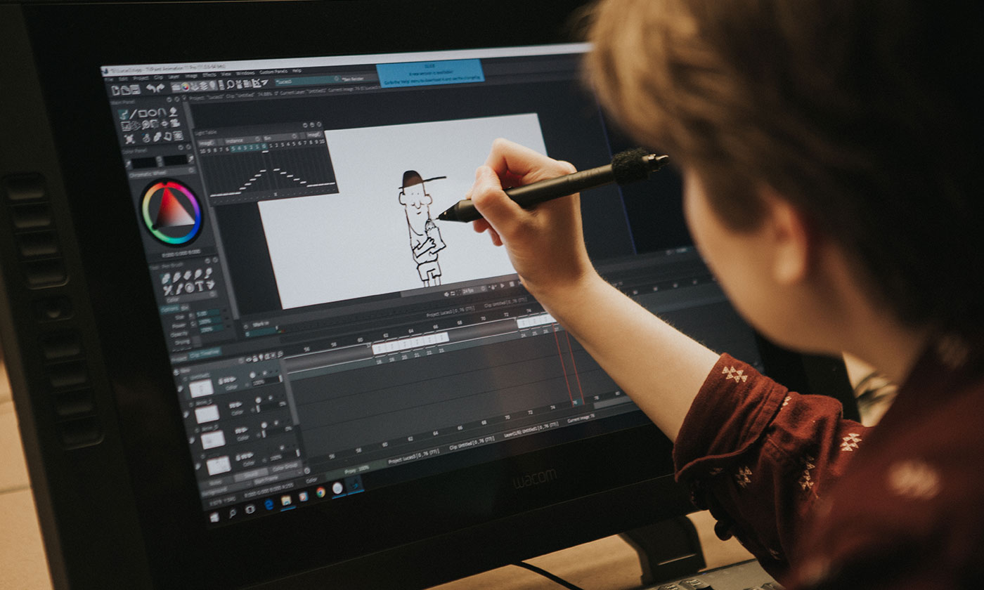
In today’s class, i did an animation using keyframes.
21/09/2021
In today’s class, I did an animation of a person using keyframes utilizing the schematic option.
Additionally, I also did a 2D puppet animation. This method of animating reminded me a bit about the flash animation that were being uploaded on New Grounds and on YouTube, an example of that would be some of the stickman fights back in 2003 and such.
24/09/2021 (EDITED 27/10/2021) (EDITED 09/11/2021)
BRAINSTORMING AND INFORMATION GATHERING
Link for original story (line 53 – 62)
I wrote out the screenplay for my animation. I also started to think about the culture from where the stories originated.


I decided that I wanted the target demographic for my animation to be teenagers. I decided this because I felt as though the demographic around this age would be most familiar with the Puss in Boots story and they would be able to recognize it in addition to the fact that they would know what to expect to a certain degree.
04/10/2021
Today I started to gather information and references for my animation. I tried looking up castles that existed during the time period of the Puss in Boots artist and started to think about what he was feeling during his creation of the story. I looked at several French castles to get a better understanding of how the architecture felt like. Additionally, i started to research the French attire during that time period, i did this because I after looking at scenes from the Puss in Boots movie I felt like I had to make my design different. One thing that I noted during my time gathering references was how heavy the clothing looked, because of the different layers and kind of fabric. Another thing that I noticed was the use of frilly and very waving cloth that would either be protruding the main body of clothing or attached to it.


I felt like I didn’t want to complicate my animation so I decided to omit that specific design trait before I begun. Additionally, by doing this I would allow for the viewer to see Puss the cat more and also help the viewer understand, that, he is in fact a cat and that the clothing is there to push the narrative and not there to be flashy.
The first thing that I noticed as soon as a started doing my designs was that, I wasn’t creating a person, it was a cat, this threw me off as I have little to no experiences drawing cats or animals for that matter. I started by drawing the design how I normally would for my human characters and then took out and added what I felt was needed. This was working out fine until I started to draw the designs in different angles.
The designs would always end up looking human like. I stared to get more research done, then i started playing around with the designs, As I stared to look at more pictures of cats I found out distinct differences that make a cat ,a cat. After a few more tries I was able to create a base line design to start working with. Furthermore, I noted to myself that keeping the design simple was the best way to allow for my to create a better flowing animation. As of right now I am thinking of working on the storyboards and backgrounds before I start back by character designs. I might need to learn how a cat moves and behaves better.


Lastly I think Tom and Jerry might be a good place to start for the designs, but I personally don’t think that they capture the feeling of how an actual cat is. Maybe it might be difficult but I want my character to feel like a real cat when animated.

05/10/2021
Today our class got an introduction into Auto desk Maya and we learnt a bit about 3D modelling as it pertains to the assignment.
27/10/2021 (EDITED 29/10/2021)
CLASS EXERCISES – 3D
After finishing a 3D design of a bunny, I started to understand a little bit more about how 3D works and the limitations and things that I would be able to accomplish. The bunny was rather easy to do, the only difficulties that I had experience was the lack of software knowledge and patience.


After completing the bunny, I attempted to rig it. This process was more simple than I had thought, and after the rigging I was surprise to see the range of movement that I was able to get whilst animating, albeit, at the expense of the bunny appearing chopped.
I did a stickman rig, which was rather simple, and as a result of me creating the stickman figure first, the bunny model was able to be done quicker. Additionally, as i previously had a bit of knowledge regarding anatomy, I found that I was able to place the joint locations better and a result allowed me to get a larger range of believable movement.
I did a lip-syncing animation with a floated head model I created. This was one of the exercises that made me realize how broad 3D animation really is. I was impressed with how I was able to get a large amount of different facial changes for the frames by doing a simple method of creating two other heads and utilizing the shape editor tool. This also me felt as though 3D animation was a sort of animation gimmick, as most of my favorite shows growing up were done in 2D. Sometimes, 3D feels like a shortcut to the finish line and I also genuinely feel like 2D is the better method for evoking a character’s emotion and action sequences. Although I cant deny the things that 3D does better, such as creating a method like was previously mentioned.
I did a bouncing ball in 3D. I tried to get some squash and stretch in my animation but I felt like I didn’t do it properly.
PRE PRODUCTION – STORYBOARD/ SCRIPT
During this time I also started working on my storyboard, I tried drawing the storyboard as detailed as possible so that when I started animating I can reference the scenes and frames easier. I tried to keep in mind the kind of look that I wanted for the animation also. I wanted my animation to have a childish simple look, similar to cartoons like Tom and Jerry, but at the same time I also wanted to have a an essence of anime like feeling to it. I felt by doing this I would be able to appeal to the a certain target demographic within the teenager group, whilst also allowing for other people to enjoy my work.
29/10/2021
Below are pictures of the storyboard that i completed.


When I was drawing up the storyboard I wanted it to have as much information as possible so that I would not have to second guess myself during the animation process. Additionally during this time, I started to realize that I might have over estimated my abilities when writing the script, as I began to think that I would not be able to animate all of the things I wanted in the script.
It was during this time that I decided to cut some of the information in the script just so that I would be able to actually complete the assignment. As a result of that, I also noted to myself, that I would have to exaggerate the scenes that were in the animation to make up for the lack of content. This train of thought led me to draw up the scene with the lion, which I am the most excited to animate.
Link for original story (line 53 – 55)

PRE PRODUCTION – CHARACTER DESIGNS
During the time I was creating the storyboard, I also started on my character designs. I had kept in mind a video I had watched a few years ago which explained that when doing works like animations, you would always, if not mostly create a design that is simple, as a result of doing this it would allow for an easier time creating the animation, and also allow the viewer to not be overloaded with information. I also kept in mind the demographic for my animation and noted to myself references of shows that are consumed by my target demographic eg, Adventure Time etc. I tried to take the simplicity aspect from shows like Adventure Time to allow for a sort of nostalgic vibe. One form of media that i inspired me during my creation process was Anime and Manga, especially for the storyboarding aspect of the assignment.

I also tried to doodle a few action poses for the characters just so I would get a better understanding of how everything should work. I had the most fun doing the Puss in Boots design and doodles because, I always thought that he was one of the coolest characters I came across and I also like playing around with the cloak that he wore.

One of the most difficult things that i encountered while doing the design for Puss, was the the face. It was rather tough for me to create some of the facial features for him, this was because it was a cat like humanoid and I didn’t understand how the mouth region of the design should look in different directions.
Additionally, I also felt my lack of knowledge where anatomy is concerned to really hinder my design and doodles from feeling alive. This could have been because of most of my previous designs utilized clothing to hide any weird anatomical errors. The color design for Puss in Boots was a inspired by the design from the actual movie. I tried having some warm colors contrast some cool colors to allow him to pop out more amongst his clothing. Additionally this color scheme was chosen to take advantage of the viewers’ familiarity to the movies in order to build interest and appeal.

During my time creating this design, I started thinking about Adventure Time and their simple design. Furthermore, I decided that I would not put much emphasis on the ogre as the viewer would only see him for a bit before he transforms. As a result I tried to keep the look of the character, one which can be created in a few minutes of less; Secondly, I also found that by doing this I would be able to easier create my 3D rig as most of the geometry is rather straightforward. I used these colors for the design because I felt as though they would match the background well, additionally I thought that the colors complement each other well whilst also not being to bright.

The picture above was what I was envisioning for my ogre design, but I feared that by doing something like that, would make my time creating the 3D rig drastically more tedious and difficult than it needed to be. Subsequently, I chose to create a design more akin to one of the models to the left or right of the large figure in the middle of the above image.
31/10/2021
PRE PRODUCTION – MUSIC
I decided that the music that I would use would be reminiscent of shows such as Tom and Jerry. Although that was the case, I am a little hesitant to add it because I am worried it may change my target audience, but I also really want to evoke a sort of French like atmosphere as the story was based on French culture and the like. As it stands right now, I am not sure what kind of music I want added, maybe I will figure it out after the animation or during the process.
DISCUSSION (no.2) – ANIMATION
Animation dates back to around 30,000 BC – 1500 AD, where people would attempt to show movement in their drawings, an early example of this would be the creation of a bronze blow with drawings illustrating the movement of a goat leaping. Fast-forward, to around the 18th and 19th century, the invention of machinery to show the illusion of movement was found and this paved the way for one of the first character mascots, Felix the Cat.

Nowadays, there exists many different ways to animate, such as Stop Motion, 2D and 3D, just to name a few. One of the most notable and older methods, which is 2D, is the first thing you think about concerning animation. Although, this is the case, and argument can be made to say that their are two forms of 2D, which is the traditional method, by which the frames would be hand drawn on paper and run through a machine to scan and put them together; and the modern form of 2D if you will, where these drawings are done on a software.

These two methods while a bit different boats the same procedure as one another, whilst the difference being one is more tedious than the other. One of the other types of animation stated is 3D, which has arguably the more widely appreciated type, at least in western countries, this can also be because of some of widely popular films such as Toy Story. This method uses models that can be controlled by utilizing them as rigs. This type of animation can be seen as more time consuming than 2D, but as a result it can bolster some incredible results.

Thirdly a newer kind of animation that has become almost an industry standard, is typographical animation. This type animates text. This type of animation is used almost always when companies want to advertise of promote some sort of product.

2D animation has become less demanding over the years with the constant use and potential of 3D animation. Although this is the case it doesn’t mean that 2D animation is obsolete, because the consumption of eastern media, such as anime has not died down and has in fact increased over the years. One challenge of 2D would be trying to make the animation less boring, as in some scenes there can be a noticeable pause which can annoy the view or make the character look rather lifeless.
3D animation while very popular, is limited to the amount of individuality in styles that can be seen with other traditional animators. In my personal opinion, 2D feels like a painting where you can notice the painters quirks and habits throughout the painting, but 3D feeling like a painting done by a robot, only done to complete the task and meet certain goals.

In today’s world we can seen the uses of animation, not only in other industries like education and marketing but also in its own creative industry. This can be seen by animated scenes being done in games such as cutscenes and the like, in addition to animated sequences for characters and other models in games. This can also be applied to films and such where the implementation of Claymation is done in conjunction with the many methods and techniques used in filming. Additionally animation can help in education.
This is particularly so in schools, because of the fact that children learn better when given new and innovative ways of absorbing information. This can be in the form of music and other practical activities, but also in animation. Children in particular lean better when given visual stimuli and as a result, animation and its implementation into the school exercises and teaching would allow students to retain knowledge easier, while also keeping them engaged in their work.
01/11/2021
3D CHARACTER DESIGN RIG
The first thing that I did when started to undergo my creation process after pre production, was the 3D rig. I decided to do this first because I wanted a clear mind while animating.

I chose to rig the ogre because I thought it would be the less stressful instead of Puss, because of the fact that Puss has a lot of weird angles and as I had now been introduced into Maya and 3D, I realized that I would not be able to get my desired design. The most confusing thing to create was the orange clothing that the ogre wore.
This was because I wasn’t sure if to create the, torso and chest area for the ogre or just create the clothing as no skin besides his hands, legs and face would be shown . As a result I just decided to create the clothing as is, this lead me to creating the clothing akin to a cone. I used lambert for the texturing for the design, but after the fact I felt as though I could have explored more options.
Although that was the case, I was able to create the design similar to its 2D counterpart, because of the extract option allowing me to separate certain areas so that I would be easier to texture.
I had the most fun animating the head and the crown. I was impressed that I was able to get the head very close to how I had envisioned it. One thing I felt I could have down better was to soften the edges as the appeared to be very sharp and pointy. This was the case because I left the rig to be rendered in the Default level state. I was determined to allow it to be rendered as such because when put into Smooth mode, some of the distinct areas I wanted to be shown was rounded out, making the design look like melted clay. As this was the case I left it as is, although I felt like I could have put more work into the design so that I would appear presentable in Smooth mode.
During the animation I tried to move as much of the limbs as possible, I also added extra frames so that the movements would be clearly seen.
ANIMATION PROCESS
I started animating the storyboard today. However, I started creating my background before that. I tried to put in as much detail into the background so that the viewer wouldn’t get bored, whilst keeping in mind the target demographic. As teenagers can get bored rather quickly, i wanted the illustration to have some areas of emphasis and interesting features.

I added in a smoke like effect as I figured it would evoke a mysterious and almost fairy tale, esque atmosphere. Furthermore, I drew with some bold thick lines as an attempt to imitate some television cartoons’ styles, to further attract my target market. Although, I tried so gain some inspiration from cartoons, I did not want my animation to fully embrace it as I felt that would make me stray away from my target audience, as a result I took note of it for the work to come.
03/11/2021
During the first two panels of the story, I decided to have has my intro where I would establish the location and add a title for the animation. I used multiple references to aid in my creation of some of the frames. I tried to look at the point in times where a fast action would be done in the reference animations and attempt to analyze them. Additionally, I tried to mimic some of the techniques these animators used, so that I could add more interest in my animation and consequently appeal to my target demographic of teenagers. I felt as though these “impact frames” which the animators used would give my animation a much heavier and dynamic feel to it if I were to utilize this skill.

The incorporation of these fast moving guiding lines from the gif below, would allow for the illusion of a fast action taking place whilst also keeping the form of the subject/subjects; this technique was something that I am thinking of using further down the line for one of the later scenes in my animation.

I ended up adding an additional second to the three seconds, that I had in mind for the intro portion of the animation, because I felt as though some of the parts looked a bit to choppy and I also wanted to ensure that the viewer would be able to recognize the title properly. This has made me be more attentive of my frames and times for future work with this project. I think that I should try to stay as close within the range that I had in my storyboard.
04/11/2021
After I finished the intro portion of the animation, I then started on the other parts. During this time it came to my attention that, I need a lot more frames during one part of the animation because of the voice lines that I were going to add later on. As this was the case I didn’t want to cause any confusion, by having the scenes changing, with the voice lines still going and consequently making it difficult to tell who is talking. Additionally, as this was the case I decided to cut out some of the lines of dialogue so that it would fit better in accordance to the scenes and frames of the animation.
15/11/2021
I finished animating the ogre scene, and it took more frames to get the scene I was envisioning. It ended up taking ninety frames. I felt as though, it was harder to have the ogre’s body fully lower of screen, so instead I decided to create the illusion of the ogre quickly descending off screen, as I found that this would be more dynamic.
I also started finished the scene with Puss in Boots. I thought that this part of the animation came out better than I had anticipated. The only thing that I might change are the clouds and sky, as I figured they need some more work. Additionally, this scene also took more frames than I thought. I noticed that I need more than i few frames to sync the voice lines with the character that is talking. I also noticed that I was off by a lot in my storyboard, when thinking about the timings of the scenes, consequently, I realized that the animation would be longer than I had initially planned. Lastly, I started working on the last part of the animation, which shows the ogre transforming into a lion. This is the scene that I am really excited to animate. I’m also thinking about animating an outro, but I haven’t decided yet.
The scenes that I animated so far, took deep consideration into the target demographic of teenagers, as this was the case, I referencing some cliché anime and cartoon aspects and attempted to implement them into my animation. An example of this would be the stare downs that occur in Dragon Ball Z.

I took moments like this, to try to build tension, and anticipation within the viewer.
17/11/2021
Today, I started doing the last part of my animation, which shows a lion. This was the scene that I had the most fun with apart from the intro, because of the intricate details that I had to add, to show the motion of the lion. Subsequently, because of the amount of detail that I wanted to add to the lion’s movements, I found myself going past my time stated in the storyboards. I felt like if I followed the storyboard timewise, my animation would look rather fast and wonky. This also made feel as though I should have taken some extra time to complete my animation.
Secondly, I also started, coloring the frames for the lion scene. I’m also noticing that some of the lines that were drawn to create more detail inside the drawings (not the outlines), appear to look a bit washed compared to before coloring. I’m not sure if its because of the color I’m using or my perception. I’ll look into it tomorrow, when I’m finishing up the scene. As a result of that, coloring is starting to seem a lit bit more tedious than before.
18/11/2021
Today, I finished the lion scene. I used Clip Studio again to draw up the background for the last scene, because Clip Studio has more options for paintings and anything similar than in Opentoonz. I wanted the background to look simple because I didn’t want to overload the viewer with information and also so that they would look at what I wanted them to, which was the lion.

One thing that was difficult to do was a zoom out effect using the camera in Opentoonz, after enlarging my background. I found that either it wasn’t possible with the software, or I was lacking the needed knowledge at the time. I decided to have a small zooming motion using the camera instead as I couldn’t find a way to solve that issue.
POST PRODUCTION – VISUAL EFFECTS
I also started playing with my post production software, Hitfilm Express. I started thinking about possible effects that I could add to my animation so that it would have a more immersive experience. One of these effects, was the grunge effects, which made the video appear with static/noise on it, similar to older televisions using poor antennas. I figured this way might create a sort of old vibe to it, which might be a good way of drawing interest toward my target demographic of teenagers. Although this is the case, I’m still not certain as to what I might add.
I will also start gathering and creating the necessary audio for my animation.
19/11/2021
POST PRODUCTION – AUDIO/MUSIC
Today, I started working on putting the different animation scenes together in HitFilm. I also found a lot of sound effects that would really bind the animation together and also create a more immersive experience. Additionally, I downloaded Audacity to aid in the voice lines that I needed for the respected characters. Furthermore I also altered the voices by playing around with some off the options in Audacity. I also reduced some of the lines to better fit the scenes.
I stuck with the trumpet sounds for the intro as a decided that adding anything else would not be fitting for the theme.
Sounds effects used in animation:
Furthermore, I also added in other roars, such as a dragon roar as I decided that it would put a dangerous feel to the ogre as he is able to transform into many different creatures and I wanted the viewer to question how many forms can he actually take on.
20/11/2021
Yesterday, I finished the post production work for my animation, and today I began rechecking everything, to make sure it was presentable and if also I was satisfied with the outcome. I also did a screening and feedback session for my animation.
One thing that I tried doing after watching a few animations during my creation, was using lines to convey feelings/atmosphere. I tried doing this in the scene where the lion was present, by scribbling lines to represent the chaos and fright present in the viewer and Puss during that certain moment.
After finishing this course I felt like it opened my mind about different software and types of animation that I wouldn’t have normally considered.
