These blog entries under the typography name will cover the things done and learnt in the classes about typography.
One of the things that was always being said during my graphic design classes were that images and placement were powerful ways of drawing attention and conveying a message. As a result, i found it strange and annoying that i was being told the same thing in my typography classes but just about type. It wasn’t until a little later and also after viewing the things around me with a different outlook, in addition to proactively looking for how the designers would choose ways to manipulate the type, whether it be enhancing scaling etc. I was finally able to see type in a different way.
The first thing our class learnt about typography, was the history of type. We discussed about the so called creator of typography, the man named Johannes Gutenberg. Gutenberg created the movable type printing which was a revolutionary invention which as a result paved the way for typography as we know it.
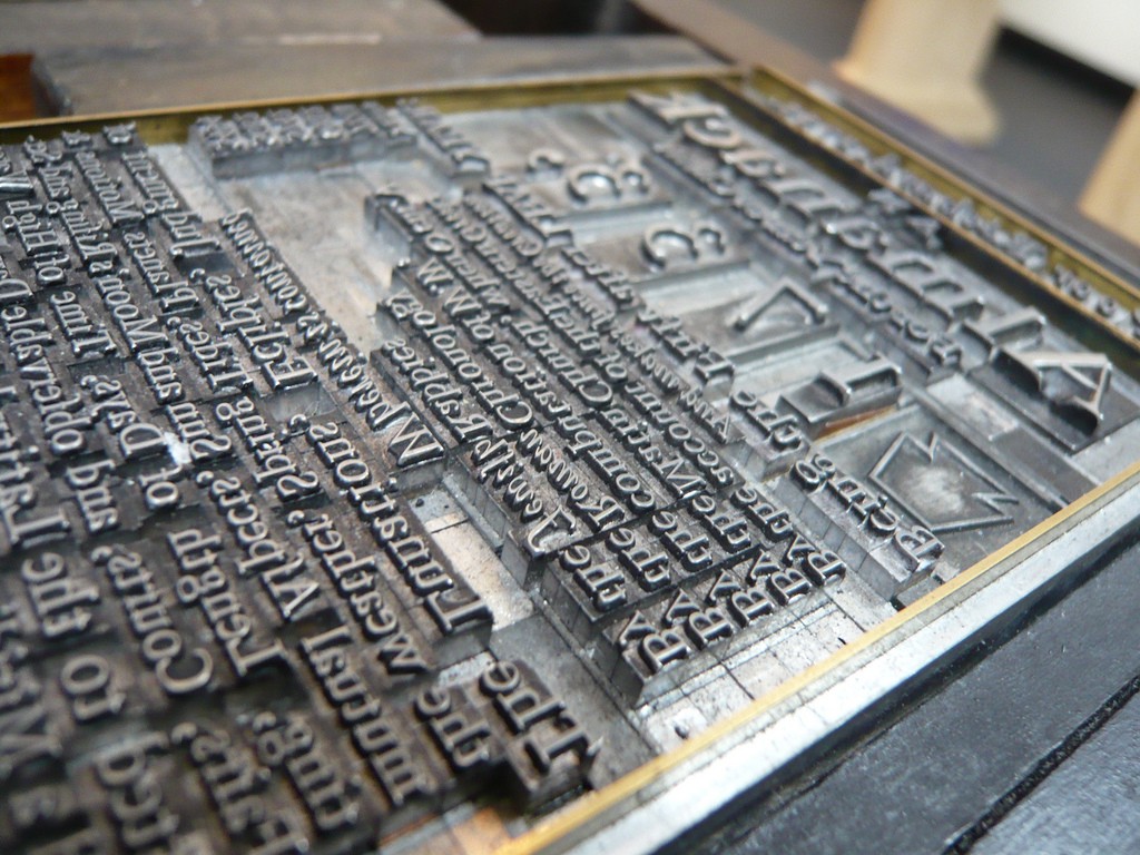
This was truly an amazing creation, as it kept all of the font consistent (size shape etc.)
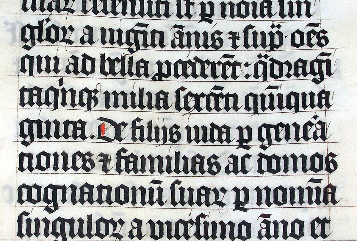
Enter, the typeface, Blackletter created by Gutenberg, possibly at an attempt to aid the scribes in their work or possibly he just used the scribes writing as a reference as this typeface was quite similar to their writing. Although, it looked like the scribe writing the typeface itself wasn’t perfect, having a jumbled look when printed which may have made it hard to read. Something had to change.
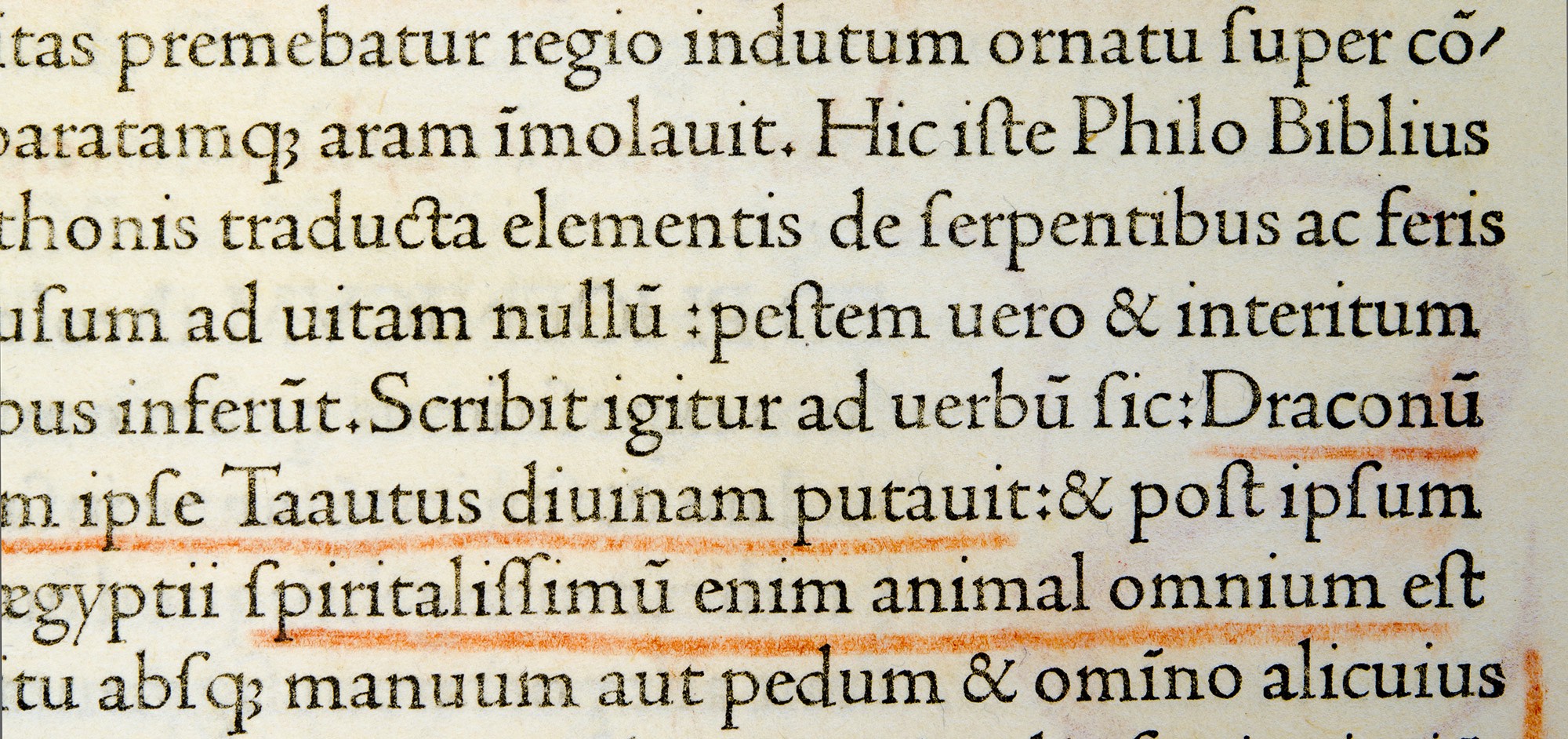
Nicolas Jenson a Frenchman in the 15th century, created the first every Roman type. As he was inspired by ancient roman buildings his design was modeled after it, as a result, his typeface ended up having a clearer legibility in compassion to the blackletter.
After this it creation the roman type created by Jenson became incredibly popular and found its way all across Europe and its notoriety quickly interested people. In the late 15 century, the italic typeface based on the roman typeface, was created as a way to save money on paper and other materials as the type was slated and allowed for more words to be placed on a page than usual.

In the 18th century, William Caslon created a typeface now known as Old style. Afterwards, another Englishman named John Baskerville created a new type of typeface now known as Transitional. Further down the line two other people created typefaces known as Modern. The basic distinction between these typefaces is the serif which is shown to be thicker of thinner depending on which typeface is being used. A serif is basically the line which is erected out by either sides of the typeface. This feature becomes more noticeable with the introduction of the san serif typeface.
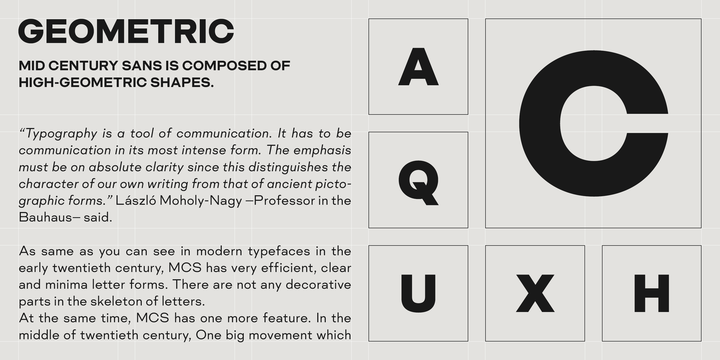
William Caslon great grandson, William Caslon the fourth, created the typeface known as San Serif, the basic distinction of this type is that all of the serifs of the type gets removed.

The san serif typeface wasn’t used much at first, but during the period of the Second Industrial Revolution during the middle of the 19th century, with the multitude of innovations and inventions being created there was an immediate need for convincing the masses to purchase products. Hence the need for billboards and posters, anything that can convey a company’s message to sell their item to the consumers. During this period people saw the need for newer typefaces, and as such the manipulation of typefaces had started. People decided to experiment by stretching, swashing and other things in attempts to create more usable typefaces.

During the 20th century the introduction of newer sans typefaces were becoming more prevalent.
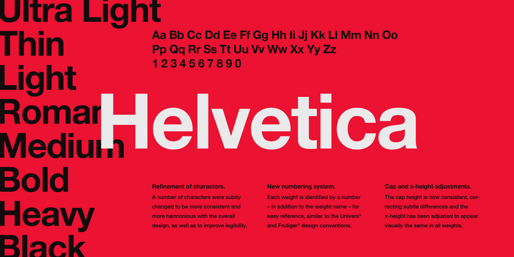
The creation of Helvetica by Max Miedinger, paved its way into the world, especially since the era of computers were upon us the use of these types of fonts were able to be used easier. This was probably what made Helvetica so popular, because of its versatility, it was easily able to mesh well together in all sorts of designs.
After learning about the history of typography, I was more aware of type and started to recall how I used it in earlier assignments. One thing that I wasn’t aware of, was the amount of history behind the serif and san serif fonts.
